PERT Chart Vs. Gantt Chart: Which One Should You Use?
Learn about task tracking with the use of PERT versus Gantt charts and which one is best for you!
Not even your most diligent coworker can instantly recall, without notes, precisely what they have to do – and they certainly can’t see what everyone else is up to without asking. Even though you might be expected to do the latter as a project manager, recalling who does what is not always an easy ask. But with PERT and Gantt charts, it gets a whole lot easier.
PERT and Gantt charts are great for planning projects, keeping up with deadlines, and dividing and conquering tasks. Read on to learn all about each chart type’s similarities and differences.
- What is a PERT chart?
- What is a Gantt chart?
- PERT vs Gantt chart: the difference
- PERT chart details
- PERT chart example
- PERT chart advantages
- Disadvantages of PERT charts
- Gantt chart details
- Gantt chart example
- Gantt chart advantages
- Gantt chart disadvantages
- Which one is right for me?
What is a PERT chart?
A Program Evaluation and Review Technique (PERT) chart is a project network diagram that interconnects related tasks while estimating the minimum time required to finish the project. It’s basically a well-organized flowchart that shows you the order, dependencies, and concurrencies of all a project’s processes.
What is a Gantt chart?
A Gantt chart, named after its creator Henry Gantt, is a bar graph that shows you the steps your team will take as your project progresses. It shows mostly the same information as a PERT chart – tasks, dependencies, timeline, process order – but for different purposes.
PERT vs Gantt chart: the difference
PERT and Gantt charts differ in three key ways:
- Schedule. Although PERT charts indicate the total amount of time your project is expected to take, they don’t align that timeline with an actual calendar. A Gantt chart ties all processes to an exact start and end date – it’s almost like adding tasks as days-long events in your online calendar.
- Assignments. Only Gantt charts indicate which team members are handling which tasks. They’re kind of like taking a walk around the office to see what your team is doing, except you can see it right from your screen.
- Best time to use. PERT charts are best used in planning instead of execution since they indicate the theoretical scope of your project. Gantt charts are best used for monitoring once the project starts since they’re tied to a calendar. This link makes Gantt charts excellent for keeping track of due dates and task completion as your project progresses.

Pro tip
Using a meeting management tool like Fellow allows you to assign, visualize, and prioritize all of your tasks to keep the momentum going after your meeting.

PERT chart details
A PERT chart is used to:
1 Identify the project’s scope for planning
A PERT chart maps out every process and task comprising a project. Each completed task goes inside a square or circle called a node, and every process that moves you between completed tasks is called a directional arrow. Your nodes and directional arrows will show you exactly how many steps – both the small ones and the little ones – your project will require. This way, you can make a concrete action plan from the jump.
2 Illustrate dependencies — the relationships between tasks
Let’s say your project is to develop and sell a new product. In that case, your PERT chart will show a development path and a sales path. It’ll also show – and this is important – that you can’t finalize the packaging without an actual picture of the final, post-development product. This is called a dependency: To include a photo of the actual product on your packaging, you need to finish making it first.
3 Calculate task durations
In a PERT chart, the arrows directing one task to the next show how long this path is expected to take. That means you’ll get a sense of how long your team needs to complete the project and see whether some steps might take substantially longer than others.
4 Pinpoint the project’s critical path
In project management, the critical path is the group of dependent tasks that takes the longest to complete. If you can move through your critical path with no delays, then great – you’ll have your deliverables ready right on time!
On the other hand, any delays on the critical path could substantially delay the whole project. It’s a phase where you have to be extra careful – and PERT charts deftly identify and detail it.
PERT chart example
Check out this sample PERT chart from time tracking company Hubstaff:
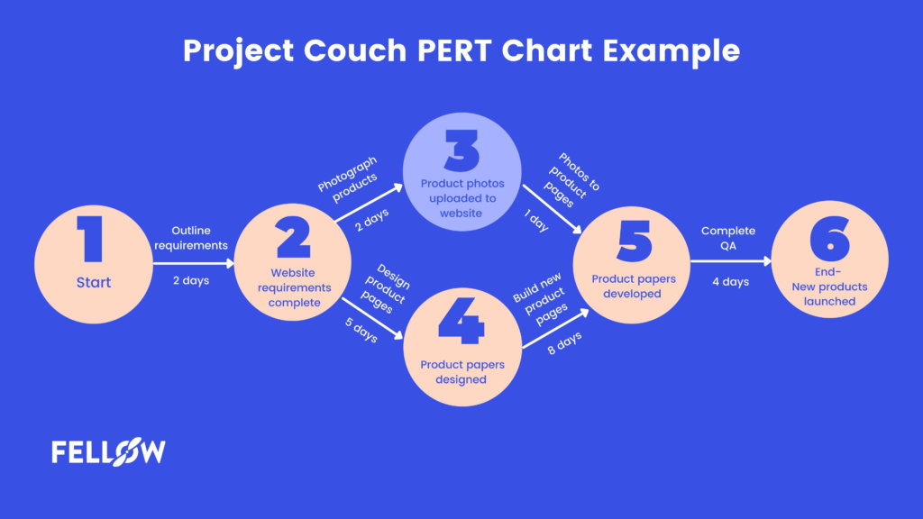
You’ll see that every directional arrow represents a process and every node represents a completed task (or, in the case of the first node, the start date). You’ll also see each process given a timeframe and the critical path highlighted in red.
Most importantly, you’ll see that this PERT chart is easy to understand. PERT charts and their parts can sound confusing in the abstract, but looking at this example shows how uncomplicated they actually are to construct and interpret.
PERT chart advantages
PERT charts aren’t just simple to build – they’re also valuable project management tools for the below reasons.
1 Setting feasible deadlines
You know that feeling of rushing through a task in a quarter of the time it needs? PERT charts help you avoid that. They make project scheduling a breeze and help you confirm realistic timelines for your clients.
2 No missed tasks
It’s inevitable that even the most organized of us will occasionally miss a task. PERT charts minimize this possibility. You can consult a PERT chart whenever you need to see whether you’re on track or return to any tasks you’ve overlooked.
3 Full project understanding
A PERT chart tells you everything you need to know about your project’s scope. Processes, their order, their duration, their dependencies – it’s all laid out there for you and your team to review.
4 Critical path identification
We’ve all been there: You set aside a certain number of hours for a project, but it winds up taking twice as long. You then wonder, how did you get into this mess?
The answer: If you’d known your critical path beforehand, you could have predicted this delay. With your most time-consuming processes mapped out, you can pinpoint where you’re losing your time. The next time you work through this process, you can make sure to power through it right away and maximize efficiency.
Disadvantages of PERT charts
PERT charts are great for quickly developing project plans, but some project managers have the following complaints about them.
1 Overemphasizing the critical path
If seeing the critical path sets off alarms in your head, you might not be alone. Some project managers think that PERT charts too strongly emphasize the critical path, perhaps in a way that implies delays and production catastrophes are inevitable. If you go in with this mindset, you might overlook tasks along other paths, and delays in those processes can put you behind schedule, too.
2 Time-consuming
To properly make a PERT chart, you need to think of each and every process in your project. In doing so, you risk over-structuring your project and losing time building an overly intricate outline. You might also find yourself a little overwhelmed determining how long a process takes.
Perhaps most importantly, a PERT chart that’s perfect now might need revision down the line. All kinds of changes to your business or market can reshape each path’s processes and durations.
3 Complicated workflows
Complex projects and PERT charts don’t always go hand in hand. For projects with many nodes that spout several directional arrows, PERT charts can quickly become messy and overcomplicated. They can become like trying to navigate the most oddly shaped of mazes: You might think you’re on the right track, but you could have to back up several steps to find your footing again.
Gantt chart details
A Gantt chart is used for:
1 Task tracking
Your team can color in portions of each Gantt chart bar as they make progress on their tasks. If they’re 40% done with their task, they should color in 40% of their bar. This setup makes tracking your team’s progress a nearly real-time affair.
2 Deadline monitoring
A Gantt chart organizes all your due dates in a logical left-to-right order. And with the task tracking technique above, it also shows you how close your team is to meeting its deadlines. This way, you can identify potential delays and plan for them before they become big problems.
3 Identifying bottlenecks
A Gantt bar that’s not filled in enough as the task’s deadline approaches will hold up the full execution of your project. This occurrence is called a bottleneck – just like how the thin part at the top of a wine bottle slows its pour, so too does an incomplete task hinder your workflow. Gantt charts make finding these incomplete tasks much easier than without a visualization tool.
4 Indicating milestones and task dependencies
A milestone is a major event in your project’s path – perhaps a website launch before you go to market, for example. Your Gantt chart will make it perfectly clear when you’re expecting to achieve these milestones. You’ll also see task dependencies so that, if one team member is waiting on another to complete a process, you can kindly check in with the second team member.
5 Getting a full project overview
Gantt charts pair processes and milestones with dates and assigned team members, so you’ll know exactly who should do what when. It’s about as comprehensive a project overview as you – and your team – can get.
Gantt chart example
This example from Venngage has several hallmarks of an effective Gantt chart:

Every activity has its own bar with a timeline tied to actual calendar dates, plus each one has a face and name attached to it. Each task also has several subtasks that show the steps in the order they should be done.
Some Gantt charts might also have a line emanating from the right end of a bar to the next bar to indicate task dependencies, but many teams fare just fine without this feature. As long as you have people and dates tied to tasks, you’re in great shape.
Gantt chart advantages
If you get to know the ins and outs of Gantt charts, they can offer numerous project management benefits. Below are some reasons why you might want to try out Gantt charts for your next big project.
1 Team transparency
With Gantt charts, everyone is on the same page. Your team members can back themselves up if someone falsely says they’ve dropped the ball, and you can know how well everyone is progressing with their work.
2 Create realistic timelines
As you add activities to your Gantt chart, the date range they span will increase. You’ll ultimately be left with a project completion date that’s actually within reach. That said, padding your final deadline by a week or two never hurts – even the most thorough Gantt chart can’t entirely prevent bottlenecks.
3 Improved resource management
Since a Gantt chart tells you who’s doing what at a glance, you’ll know who’s free to take on more work. You’ll also get a sense of who’s using which of your tools, which can be important if someone else needs access to the same resources.
4 Easier problem spotting (and solving)
If you’re a few days out from a milestone and the assigned team member’s bar isn’t nearly filled in enough, you might have a problem on your hands. The good news is that you’ve identified it – doing so would’ve been much harder without your Gantt chart. Your Gantt chart can also indicate who’s ahead on their work, and you can pull in these folks to pick up the slack.
Gantt chart disadvantages
Some project managers love Gantt charts, but others aren’t quite as fond of them. Some reasons why Gantt charts don’t always fit perfectly are below.
1 High maintenance needs
Your teammates are busy people – it’s natural if they accidentally forget to mark their progress on their Gantt bars after doing some work. The thing is, this exclusion can indicate a bottleneck that isn’t there. Just one mistake with a Gantt chart can paint a false picture.
2 Complexity
A Gantt chart with an abundance of activity bars can quickly become so complicated that it defeats the chart’s very purpose: organization. And with more bars comes higher chances that you won’t notice something concerning, such as an activity with no progress for days.
3 Time vs. effort
Your Gantt chart will tell you how long an activity should take, but it might not indicate how difficult the task is. Will the assigned team member need to put their all into it, or will they have the capacity for their other responsibilities? You’ll want to answer this as you distribute your work, but Gantt charts won’t help you figure it out.
PERT chart vs. Gantt chart: Which one is right for me?
The PERT and Gantt chart binary is somewhat of a misconception. You could easily figure out your rudimentary workflow with a PERT chart, then add this workflow to your project management software as a Gantt chart. It’s possible to use both, especially since PERT charts are better for planning and Gantt charts for executing.
Realistically, though, you’ll only have time to implement one. In that case, Gantt charts might be best for teams new to certain tasks, and PERT charts might be best for teams used to the paths ahead. And if you’re looking to streamline your charts, don’t forget that Fellow includes action item tools that go hand in hand with task tracking.
-
 Management
What Is Resource Leveling in Project Management? (+ Examples)
8 minute read -
Productivity
How to Create an Effective Project Timeline Visualization
7 minute read -
Management
Addressing Project Management Dependencies
6 minute read -
Productivity
5 Essential Steps to Project Scheduling in PM
8 minute read -
Productivity
What is the Critical Path Method? A 7 Step How-to Guide
8 minute read -
Management
RACI Chart Example and How To Use It in the Workplace
8 minute read -
Meetings
RACI Meeting: Your Complete Guide to a Well-Informed Team
7 minute read -
Productivity
7 Tips to Meet Your Deadlines Every Time
6 minute read -
Management
Bottom-Up Vs Top-Down Management: Which One Is Best?
7 minute read


-
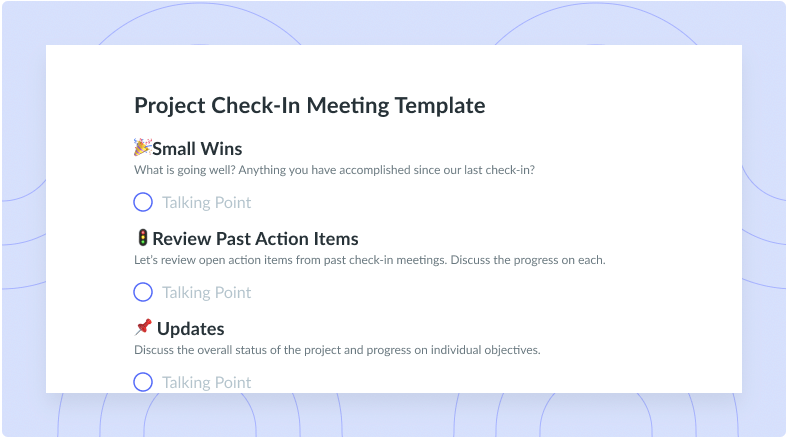
Project Check-In Meeting Template
-
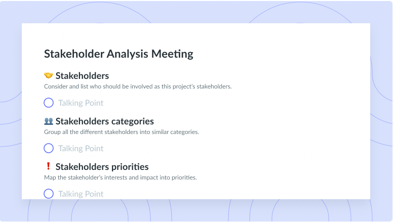
Stakeholder Analysis Meeting Template
-
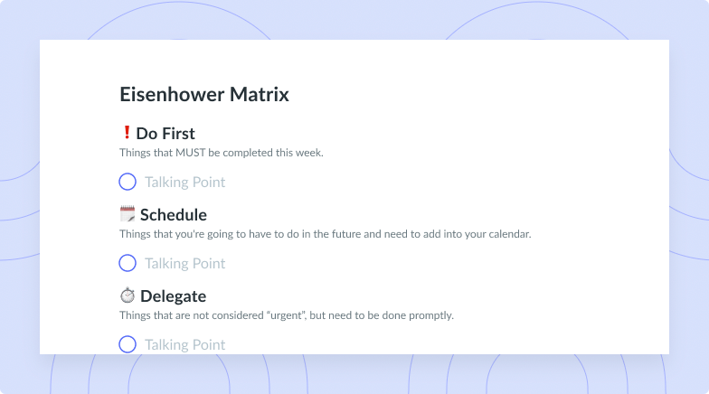
Eisenhower Matrix Prioritization Meeting Template
-
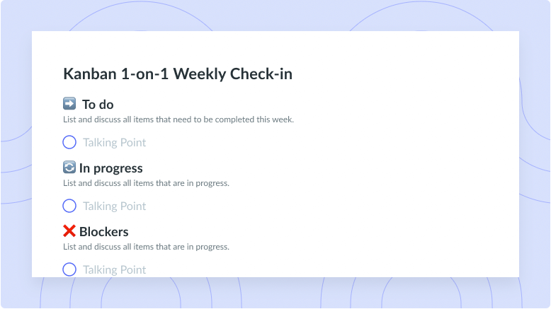
Kanban 1-on-1 Weekly Check-in
-
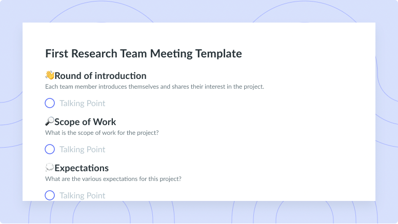
First Research Team Meeting Template
-
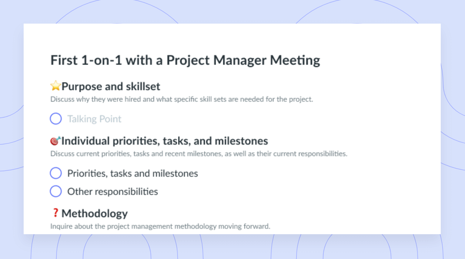
First One-on-One with a Project Manager Meeting Template
-
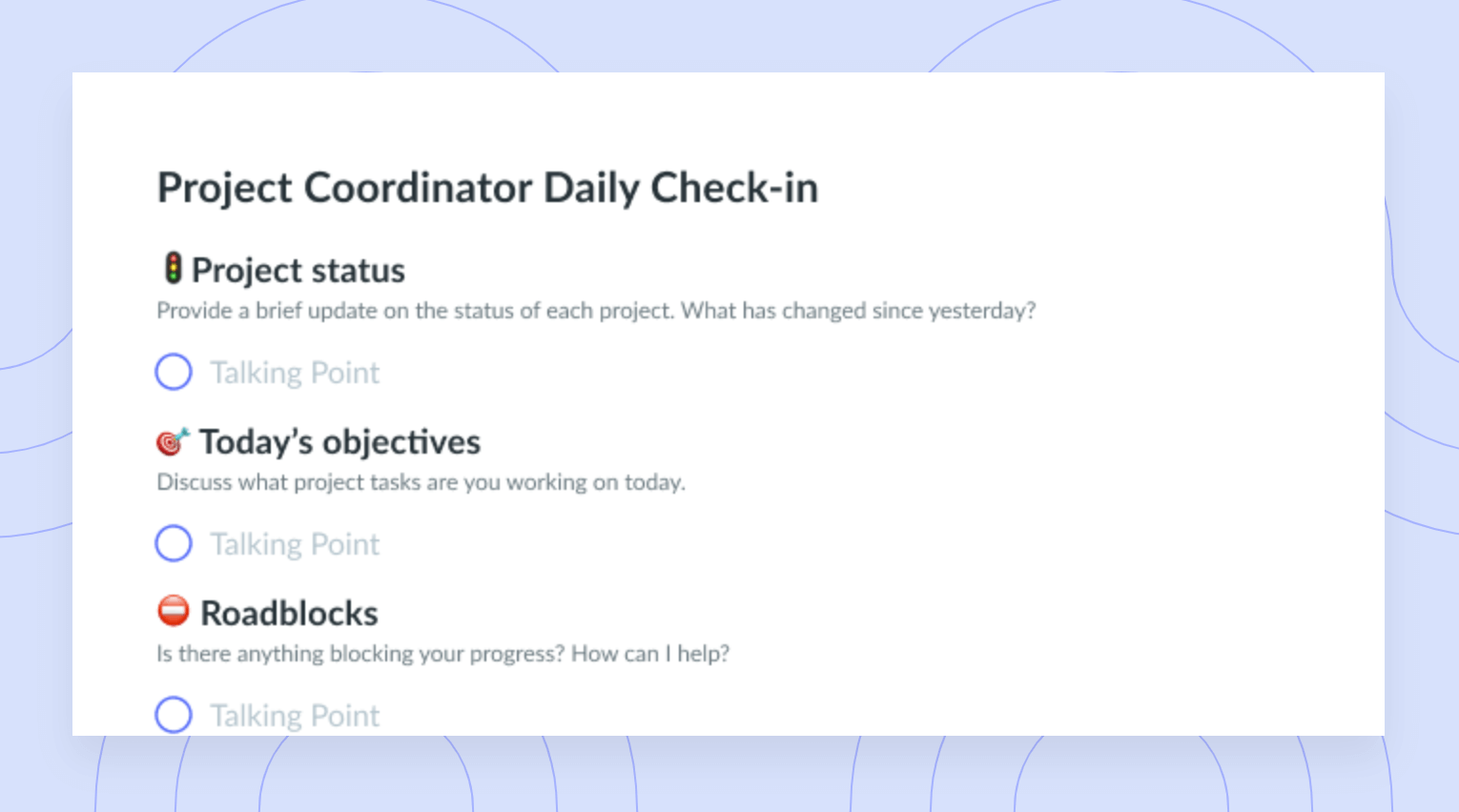
Project Coordinator Daily Check-In Meeting Template
-
Design Brief Meeting Template
-
Business Acquisition Inquiry Meeting Template